Contextual onboarding is the unspoken hero in successful onboarding.
It’s the little features and actions that help your users understand and navigate your platform.
Understanding the role contextual onboarding plays in the user journey helps create a delightful experience for your users. The more supported and guided users are, the less frustrated and more engaged they become — which leads to higher conversion, retention, and loyalty.
Are you looking for a smooth user onboarding tool?
Try Product Fruits with a free 14-day trial today!
What is contextual onboarding?
Contextual onboarding guides users through a new platform using messaging, hints, and features within the user’s journey.
The goal of contextual onboarding is to help users during their onboarding journey by providing supportive information and content, such as tooltips and hints.
This allows users to onboard at their own pace and tailored to their individual needs. By doing so, users avoid feeling overwhelmed by learning about too many features at once.
For example, let’s say you’re about to use an online shopping platform for the first time. Instead of showing you how to list, buy, change, and add items to a favorite list, the platform only shows the most relevant features to the user. This avoids overwhelm and helps tailor the onboarding journey to different user goals.
Contextual onboarding gives helpful tips for a user’s particular goal. In this case, the goal could be to “sell clothing items.”
Therefore, hints would show the upload button, descriptions, and steps to upload.
With tailored hints that accompany users throughout the platform, users get the information they need to succeed without feeling overwhelmed.
Benefits of contextual onboarding
Users prefer to learn a platform independently and at their own pace. This gives users the autonomy to navigate a platform (with support) without feeling like they’re being pushed or influenced into using an app.
As a result, contextual and self-serve guidance has a 123% higher completion rate than onboarding based on tours.
Contextual onboarding also provides ongoing support. Resources, hints, and tools are continuously accessible. Users don’t need to look for help, as contextual onboarding nudges users with information as they go along a process.
This saves time for both users and the customer success team. As the helpful information is always there, users rely less on the support team.
Contextual onboarding is key to product adoption. It should be incorporated into all features, actions, and processes that a platform offers. This means that users will continuously orient themselves without frustration while using your product.
Challenges of contextual onboarding
Unlike guided onboarding tours, where you have complete ownership over what users see and experience, contextual onboarding means less control.
Contextual onboarding requires careful planning to engage users, build trust, and integrate contextual onboarding into existing applications and systems.
Here are some of the most common challenges when creating contextual onboarding:
- Missing order of events: Contextual onboarding doesn’t necessarily take users through a sequence of actions step-by-step. It’s helpful to add numbers or clearly indicate the next steps for a sequence of events.
- Poor design: Hidden hints or icons could mean users lose helpful information. Make sure all hints and tooltips are visible and clear.
- Tricky instructions: Tooltips can risk being too informative or not informative enough. Consider adding a link to the help center to guide users to additional resources and tutorials.
- Murky data: Understanding user behavior in contextual onboarding can be more difficult. But one thing’s for sure: contextual tips give users information, which reduces frustration and abandonment.
5 practices to help guide users using contextual onboarding
Focus on creating straightforward explanations for any complex topics, both to make sure that users understand unfamiliar with the product or service and to provide an overview of what is next in the process.
1. Be extra informative
Be overcautious when choosing where to put your contextual hints, especially for new users learning the platform.
Users click on hints to understand a feature’s action. Therefore, these contexts should contain descriptive information about certain actions.
Avoid complex jargon. Instead, opt to tell users exactly what each button unlocks.
Here’s an example of how HubSpot uses contextual clues for its users.
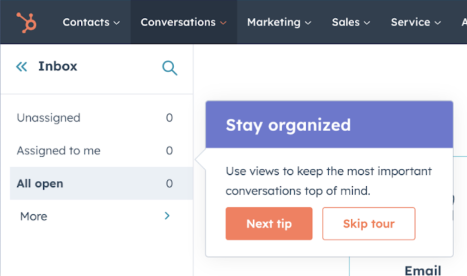
(Image source: HubSpot)
2. Define the next steps
The biggest challenge with contextual onboarding is the lack of order. Once users have read a hint, their next action step isn’t always clear.
Include the next steps as an instruction, numbered list, or highlighted next feature button.
Here’s an example of how Loom uses hints to show users the save button. Not only does it inform users of a benefit of their app (save feature), but it also gives users instructions on how to accomplish the next step.
Fruity Tip: Include checklists to avoid platform abandonment. Checklists are the perfect balance between self-service onboarding and guided support. They allow users to accomplish tasks on their own time, while still providing a helpful roadmap of actions.
3. Add additional support
For more complex buttons or features, hints or tooltips won’t be helpful for users. In this case, you could go in three different directions:
- Mini tours: Provide a mini tour for a complex feature. This choice is better when many steps are involved.
- Resource redirection: This option includes additional resources from the knowledge base or help center. It is better when features require more detailed explanations or development.
- Media: Include videos to explain features, possibilities, and benefits. This option is best when new buttons are included or if the feature is too complex for tours but not complex enough for resource centers.
4. Make help icons clear
Make sure that help tooltips and hints are clearly placed near a function. You don’t want users to overlook a function because they can’t see the hint.
And, it’s good practice to make information hop out when clicked or hovered on. The hint should not display information at all times, only when required.
5. Leave out the murky- Test it out with users
Ask users to go through the onboarding and share their thoughts out loud. Analyze how they navigate through the platform. Keep a close eye on what steps they take, whether they miss any actions, and, more importantly, whether they get stuck somewhere.
This is arguably the most important step. It will show you any loopholes where information is needed. And once those missing links are found, you can add information to avoid further frustration or confusion.
Follow these best practices to create successful contextual onboarding experiences.
Don’t leave onboarding to chance – support your users
Don’t leave users to figure it out. Be strategic about their first impression of your product.
A product onboarding tool supports your team with all the necessary pieces to create a delightful onboarding experience that drives retention, engagement, and growth.
Product Fruits is a no-code tool that acts as an invisible layer on top of your platform. With a click of a button, you can add, edit, and change onboarding tours and processes.
Interested in improving user retention and growing your user base? Talk to our onboarding specialists to see how we can help.
Are you looking for a smooth user onboarding tool?
Try Product Fruits with a free 14-day trial today!
