Onboarding is like a first date, you’ve got to leave a good impression if you want a second one.
But it’s nerve-wracking.
You need to make sure users understand the product and its features, AND that they have a positive experience with the product from the get-go.
An onboarding product hint helps guide new users through the process of using a product. They make the user experience smoother and more successful.
Let’s explore the importance of onboarding product hints and explore the best practices to implement them.
What are onboarding hints?
Onboarding hints are instructions presented to new users during the product adoption process. Their purpose is to help users understand a platform’s features and how to reach their goals.
Onboarding product hints are a great way to make the onboarding process smooth and successful for new users.
These hints can be displayed as tooltips, pop-ups, or in-app messages that guide the user through the product’s features.
Here’s an example of how HubSpot uses hints to help users explore their platform features.
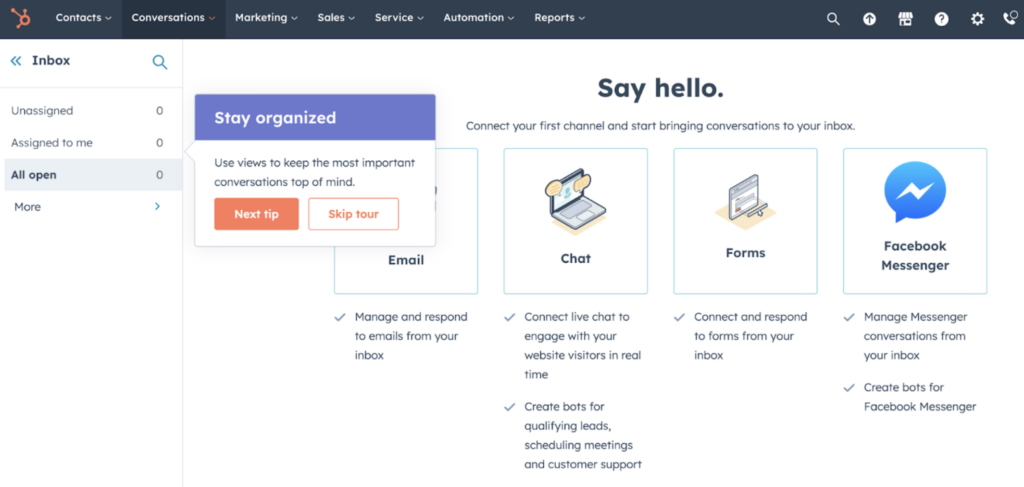
(Image source: HubSpot)
Hints introduce new product features and updates in a non-intrusive way. They allow users to make the most of new features and updates without needing extensive training.
They also help users identify best practices and understand the value that the product provides.
With clear instructions, users can effortlessly fulfill their goals.
Why are hints important for effective user onboarding?
Hints educate users to navigate a new platform with ease. Which is key for contextual onboarding.
Contextual onboarding means users are given context specific infromation to the product or feature they are currently using. This gives a better understanding of the product and reduces the learning time.
User onboarding product hints can:
- Improve engagement: Help users reach their “aha” moment faster. When users immediately grasp the value an app offers, they’re more likely to engage with the platform.
- Reduce churn: Remove the confusion or misunderstanding that more complex platforms may offer. As a result, users are less likely to look for solutions elsewhere, which equals less churn.
- Avoid frustration: Product hints are a great way to prevent users from getting stuck or frustrated when using a product. By providing users with hints, they can make progress with minimal effort and confusion. This ensures a better user experience overall.
- Save time: Instead of users spending time searching for a solution, hints and tooltips can quickly resolve any questions.
- Enhance the onboarding experience: They give users a quick walkthrough of the product, so they learn the basics quickly and easily. This can help users become more comfortable and proficient with the product faster.
Product hints give you the opportunity to continuously educate the user on the possibilities, benefits, and value your app provides.
Identify where product hints are needed
Spotting and pinpointing areas to add hints is key to making the onboarding experience effortless.
But that requires careful planning, clever copy, and customizable product hint buttons.
To create a product hints system that integrates seamlessly with your platform, here are a few steps to start.
- Understand the user’s goals and objectives
- Match the goals and objectives with the features of the product. Include common tasks associated with accomplishing a certain product goal
- Map out an initial user flow to trace an onboarding roadmap
- Use data to provide valuable insight into areas where users may be struggling or confused
- Introduce targeted product hints that address these issues directly
- Test it out with a sample target persona
- Evaluate how to incorporate helpful product hints into existing onboarding processes such as tutorials or FAQs sections
By putting yourself in the perspective of the user, you’ll be able to empathize with their frustrations, concerns, and desires.
At the end of the day, creating the most desirable onboarding experience through their eyes is the most important thing.
3 examples of product hints and how they are used
Product hints provide a clear path for users to understand the features of a product, complete necessary tasks, and become familiar with it quickly.
1. Helpful text – a little copy goes a long way
Product hints can come in the form of little spurts of information. Usually, it describes a feature’s function, or what will happen when you click a button.
They help users understand a feature before selecting it. By doing so, it helps avoid mistakes or confusion.
Here’s an example of how Mailchimp explains its menu functions with some helpful hints.
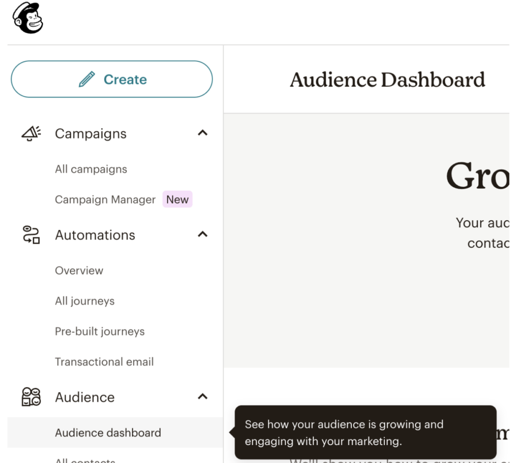
(Image source: Mailchimp)
2. Images to visually share complex information
Images are a great way of visually sharing what action a function performs. Adding media also adds a level of engagement and gives an opportunity for more brand personalization.
Images in hints are especially helpful when features are slightly more complex. Here’s an example of how Loom includes screenshots to explain button features to pin videos.
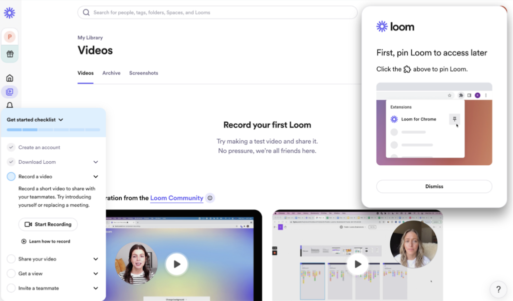
( Image source: Loom)
Videos can be an addition to images and text to provide further instruction on how to use particular features or walk users through certain processes step by step. Videos add an extra layer of engagement for users who prefer this type of content over reading long paragraphs of information.
3. In-app notifications for new product releases or features
Hints also keep users up to date with the latest developments and encourage them to try out the new features.
They provide a gentle reminder to users that something new has been released. And, they create a level of excitement and anticipation around the new features.
Here’s an example of how Zapier includes product hints in their platform to inform users about new webinars.

(Image source: Zapier)
4 best practices for onboarding product hints
The correct hint placement and choice of information is what will make a hint relevant or not. If hints aren’t well placed, missing, or irrelevant, users can quickly get frustrated looking for the information they need.
Here are some practices to make hints as useful as possible.
1. Take into account the goal and context of the user
As onboarding flows are created, it’s important to consider where product hints fit in. Ideally, hints inform users of a feature’s function. You need to consider the goal of a user when placing hints.
Each hint should highlight how a feature helps reach that goal. For example, if a user downloads a music app to create a playlist, the buttons to add music and edit should include hints.
Consider the context of the user, if they are new to a platform or if a platform is complex. Including hints removes the risk of users being unable to understand how to use a product.
2. Include media to add more context
Hints are often reliant on clever and clear copy instructions. However, when features are more complex or require more context, media is a great help.
Include media such as images and videos, to help users grasp a feature’s function. Additionally, if a feature is complex, consider providing a tutorial or walkthrough.
3. Add a link to resources and tutorials
In most cases, a simple explanation of an icon is enough for users to understand the feature. But, there are cases, like, for example; new features or multistep features where a little extra information is required.
This is where adding a link to the help center with resources or tutorials is helpful. It allows users to develop more information in their own time and when they are ready.
4. Test it out with real customers
It’s good practice to run through user onboarding flows with a sample audience. Pay close attention to where they struggle, their actions, and what they spend the most time on.
This exercise will give you insight into where to add product hints, how much information to include, and whether better placement of actions is required.
By following these best practices, companies can create a smooth journey for their customers throughout the onboarding process.
Hints are just one small part of the onboarding journey
Hints form a small ( but mighty) role in the ecosystem of the onboarding journey. However, they need to work in unison with other features that help users orient themselves on a new platform.
Whether it’s tours, demos, or checklists, hints are like the cherry on top. They are a form of consistent support but rely on other onboarding features to give the full picture.
That’s why it’s important to have a fully comprehensive and customizable onboarding tool to continuously optimize the user experience. A simple tweak in a tour or a new feature affects the rest of the onboarding system. It’s critical to have a flexible solution that lets you share new updates, features, and news immediately, — without relying on development time.
Product Fruits act as an invisible layer atop your platform. It allows you to tweak the onboarding flow with a couple of clicks (no coding required) to meet your customer’s needs.
Stay on top of trends, customize tours, surveys, hints, and more to your brand tone, and provide a seamless experience to your users.
Try Product Fruits for free today, no card or commitment required — we’re confident we can create a beautiful onboarding experience together.
