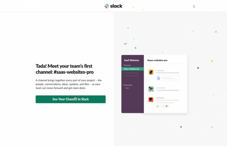
Imagine attempting to prepare a fancy meal without a recipe book.
God forbid, the taste and your frustration would directly correlate… If only you’d have followed a book’s recipe, the food would be finger-licking good.
SaaS knowledge bases are like digital recipe books but for software navigation. They help customers find answers to their queries quickly.
A carefully curated knowledge base helps users self-educate and alleviate the pressure on your support team. While a poorly designed knowledge base experience can leave your users confused.
So, if you’re creating a help center or looking to improve your existing one, you’re in the right place. We did the heavy lifting by researching the five best SaaS knowledge base examples to inspire you.
But, first things first…
What is a SaaS knowledge base?
A SaaS knowledge base is an online repository of information created and made publicly available to help users navigate a platform and its features.
Typically, they contain various information and resources, such as FAQs, troubleshooting guides, video demonstrations, product documentation, company information, best practices, and educational content, such as blog articles, webinars, and case studies.
Interestingly, a survey revealed that 67% of consumers rely on knowledge-base help before talking to a business agent because of privacy issues.
A well-structured knowledge base benefits users by offering instant support while reducing the volume of support requests. This helps save time and resources for your team to concentrate on more strategic initiatives.
Benefits of having a good knowledge base
A study revealed that 91% of respondents would use an online knowledge base if available and tailored to their needs. It underscores the importance of having a good knowledge base.
With an education knowledge base, your team can:
- Provide faster customer service and reduce support requests.
- Improve customer satisfaction and brand loyalty.
- Reduce support costs and improve the efficiency of customer support.
- Build trust and support with users, which asserts a competitive advantage over rivals.
- Introduce 24/7 accessibility for users and employees.
Five best knowledge base examples
A user-friendly and straightforward interface characterizes a good knowledge base. It needs to be accessible for both users and employees to quickly and easily find the information they’re looking for.
Let’s dive into some of the best use cases for knowledge bases.
1. Product Fruits – Organization and structure
Image source: Product Fruits
Product Fruits is an all-in-one user onboarding platform that offers a variety of tools and features that help businesses improve onboarding conversion and retention rates.
What we like about Product Fruits knowledge base:
Product Fruits has a knowledge-base feature to create a user-centric experience. The knowledge base (built using Product Fruits) is a testament to our expertise and user engagement.
Image source: Product Fruits
Product Fruits offers users access to their knowledge ring at all times. The help option is always visible on the screen, and direct links to knowledge base articles are included within hints to relevant features.
- Integration with the Life Ring Button provides swift access to knowledge-based articles.
- User-friendly article organization with clear headings, subheadings, and bullet points for quick navigation.
- Incorporation of media, using images and videos, throughout the knowledge base enhances the user experience and simplifies complex concepts.
- Clear customization and organization make the Help Center user-centric and tailored to individual company needs.
- Three simple categories conceal the sheer amount of information available to users. Also, there are some featured articles that the user can read without diving deep into the guides.
Fruity tip: Strategically place content so users can swiftly resolve their problems without extensive searches or category browsing.
2. Slack – Clear and concise
Slack is a popular collaboration and communication platform teams and organizations use to streamline their work processes.
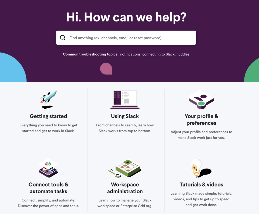
Image source: Slack
What we like about Slack’s knowledge base:
Without a doubt, Slack’s knowledge base stands out for its simple navigation and excellent search functionality.
Image source: Slack
- The Slack knowledge base maintains its strong brand tone while visually appealing with vibrant colors and fun characters like emojis.
- The knowledge base integrated rich media, like images, videos, and interactive visual content, to enhance communication and provide clear visual understanding.
- It’s well-organized and structured. Slack placed the most crucial information first, followed by topic clusters and other featured articles. The prominent search bar and clickable filters help users quickly find relevant information.
Fruity tip: Look for the content/questions people need the most from different support requests, and put those solutions at the beginning of your knowledge base. When customers see answers to their questions right away, they’ll keep returning to your knowledge base.
- Slack’s homepage features quick tips and featured articles for users before they dive into the help center.
- Slack has added practical examples, links, and tips throughout its knowledge base in the guides to steer users in the right direction.
3. Veed.io – Optimized and intuitive
Veed.io is an online video editing platform that offers a range of features to help users create and share short and long-form videos suitable for social media, podcasts, YouTube, ads, and more.
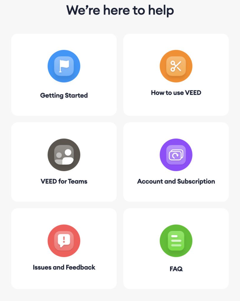
Image source: Veed.io
What we like about the Veed.io knowledge base:
- Veed’s knowledge base is minimalist and is not cluttered with many sections- which is pleasing to the eye.
- It has a clean and intuitive interface, making it easy for users to navigate and find the information they need.
- They laid out instructions in articles with simple steps that users can easily follow without ambiguity.
- They inserted screenshots throughout their solution articles and tutorials to better convey the solution to visitors.
- Their knowledge base is regularly updated to reflect the latest features, improvements, and best practices, making sure users can access the most up-to-date information.
- It’s also optimized for search engines, allowing users to find relevant information quickly and easily. This optimization helps boost the platform’s visibility and attract new users.
Fruity tip: Index all the self-serve articles by the search engines. Optimizing your articles will help you to rank high on SERPs and directly increase conversions.
4. Visme – Incorporation of visual elements
Visme is an all-in-one platform that empowers non-design professionals to create and share engaging visual content, including presentations, interactive infographics, videos, and more.
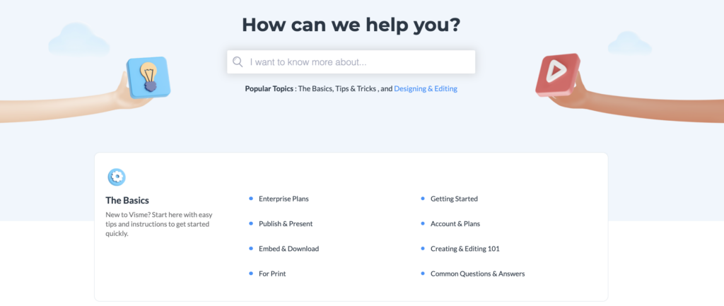
Image source: Visme
What we like about Visme’s knowledge base:
When writing and structuring your knowledge base, be frank and straightforward. And Visme does this very well.
- They segregate the main headings into six categories. Each keyword has various troubleshooting guides that quickly simplify finding the right one.
- Their content is easy to understand, which makes it accessible to users with different levels of expertise.
Fruity tip: Always address your reader using active voice. Talk to them like you would over the phone.
- The articles are accompanied by visuals, such as screenshots and videos, to support the learning experience.
- They kept their branding subtle; they opted for simple design elements to bring their knowledge across.
Image source: Visme
5. Dropbox
Dropbox is a file hosting service that offers cloud storage, file synchronization, personal cloud, and client software.
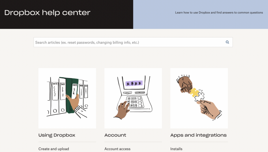
Image source: Dropbox
What we like about Dropbox’s knowledge base:
- Dropbox excels at showcasing the most popular articles readily accessible on the top and prioritizing solutions to the most common customer issues. This user-focused approach ensures that users can quickly find answers to their primary questions without any guesswork.
Image source: Dropbox
- They place “related articles” links within each solution article. This helps users to hop on articles without having to search for them endlessly.
- Dropbox uses knowledge-based analytics to monitor user behavior within the help center. This proactive approach helps users quickly locate answers related to specific topics, minimizing the need for multiple clicks and facilitating efficient problem resolution.

Image source: Dropbox
Start building your knowledge base today!
We trust that the showcased help center examples have sparked some creative ideas.
One key takeaway is to ensure that users can effortlessly contact your team for further assistance when necessary, as your success is closely tied to theirs.
Now, it’s your turn to implement these strategies and learnings and build a knowledge base that resolves customers’ issues and inquiries.
Your knowledge platform is only as successful as the platform you use. To impact the user experience, you need a highly customizable knowledge base that adapts to your platform. Product Fruits acts as an invisible layer on top of your platform. You can add links to your knowledge base from hints, features, or triggers.
Product Fruits differentiates itself from other solutions by offering secure and safe knowledge bases. You can restrict knowledge to users through authentication. Or, opt to include your knowledge base in your platform’s domain.
With Product Fruits, no coding is required. Quickly respond to users’ needs by uploading, updating, and editing knowledge articles with a few clicks of a button.
Crafting a knowledge base doesn’t have to be daunting – our no-coding software simplifies creating support content.
Create your knowledge base today with our free 14-day trial, or talk to our onboarding specialists to discuss the best approach to reach your onboarding goals.


