The onboarding process is a make-or-break for new users. Period.
Your onboarding flow should be intuitive and engaging since it’s the user’s first experience with your product. But user needs and preferences evolve, and what resonates today may not work months from now.
That’s why it’s so important to optimize your onboarding continuously. This blog shares easy ways to improve your existing onboarding experience.
We’ll discuss how to gather and apply user data, surface underutilized features, refine content based on common hurdles, and create a smooth onboarding flow that fits your audience well. With an optimized onboarding flow, you’ll see lifted engagement, better feature adoption, and increased customer retention.
Let’s get started.
Start by monitoring metrics
Monitor specific numbers and data points to improve your onboarding process. These metrics will reveal how well your current onboarding performs and where you can make adjustments.
Identify key metrics to track
We’ve got a whole blog dedicated to user onboarding metrics and conversion funnel analytics, but for the purpose of this article, here are the ones to keep in mind:
1. User drop-off rates
It measures how many users start the onboarding process but don’t finish. High drop-off rates can indicate that parts of your onboarding are confusing or too time-consuming.
Example: If you notice that many users drop off at a particular step, you can investigate why that step is causing issues. The instructions may be unclear, or the task is too complex.
2. Time to completion
This metric shows how long it takes users to complete the onboarding process. Users might get frustrated and abandon the process in halfway if it takes too long.
Example: By tracking this, you might find that users spend excessive time on a specific form. Simplifying or breaking the form into small parts could speed up the process.
3. User feedback
Collecting user feedback can provide insights that quantitative data alone might miss. This can include surveys, feedback forms, or direct communication.
Example: After completing onboarding, you could ask users to rate their experience and provide comments. When many users find a particular step confusing, it indicates that changes must be made.

4. Engagement rates
Look at how engaged users are with your onboarding content. Are they watching instructional videos, reading guides, or skipping through them?
Example: If your data shows that users are skipping through videos without watching them, it might be time to shorten your videos or make them more engaging.
5. Activation rate
This measures how many users act (like making a purchase or using a feature) after completing onboarding. It helps you see if onboarding is setting users up for success.
Example: If your activation rate is low, it might mean that your onboarding isn’t effectively teaching users how to use your product.
Tools and methods for tracking these metrics
There are different ways you can keep an eye on your analytics. Here are some we recommend:
1. Analytics platforms
Product Fruits offers comprehensive analytics and feedback tools to help you monitor user behavior throughout onboarding.
You can track user drop-off rates and time to completion and gather direct feedback from users using NPS surveys.
2. Heatmaps
Platforms like Hotjar and Crazy Egg create heatmaps of where users click and how they navigate your onboarding process. This visual data can highlight areas where users might be getting stuck.
3. Surveys and feedback forms
To gather surveys, you can use tools integrated survey tools, or use Product Fruits to get direct feedback from users, which can be used to gather user opinions on the onboarding process.

4. Session recordings
Tools like FullStory or Smartlook record user sessions so you can watch how users go through the onboarding journey in real-time. This can uncover unexpected user behaviors or issues.
Analyze support queries
Users who face difficulties during onboarding often turn to your support channels for help. Monitoring these channels’ search terms and queries can provide insights into areas where your onboarding flow might fall short.
Why is it important to monitor search terms in support channels
By tracking the terms users are searching for in your support channels, you can:
1. Identify pain points
Frequent searches around specific topics or features may indicate that your onboarding content is unclear or lacking in those areas.
Example: If many users search for “how to reset password” during onboarding, it might indicate that the password reset process is not clear or easy to find.
2. Understand user intent
The language users use in their queries can give you insights into their thought processes and goals. It can help you refine your onboarding content to address these specific needs.
Example: If users frequently search for “where to find tutorials,” it might indicate that your onboarding content needs more visible links to educational resources.
Use support data to improve onboarding content
Once you’ve identified common pain points and areas of confusion through support queries, you can take the following steps:
1. Update FAQs and help content
Add or update FAQs based on common support queries. This can help users find answers more quickly without needing to contact support.
Product Fruits allows you to embed FAQs and help documents directly into your onboarding flow with a life ring button. This helps users find answers quickly without leaving the onboarding process.
Example: If many users ask about setting up profiles, create a detailed FAQ section with step-by-step instructions and screenshots.

2. Improve onboarding instructions
Revise the instructions and guidance provided during onboarding to address common pain points highlighted by support queries.
Example: If users are confused about linking their accounts, add a clear, detailed walkthrough in the onboarding flow.
3. Create tutorial videos or interactive guides
Use the insights from support queries to develop tutorial videos or interactive guides that address user’s common issues. You can easily create and embed these tutorials into your onboarding process with Product Fruits.
Example: If users often ask about creating knowledge base content, create a short video or demo guide (like the one we linked) demonstrating how to use it and include it in the onboarding process.
4. Simplify complex steps
If certain steps consistently generate support queries, consider simplifying them. Break down complex tasks into smaller, more manageable steps.
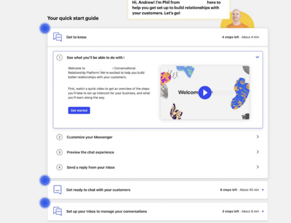
Example: Look at how Intercom splits the checklist into chunks. Rather than having an endless list of items, Intercom grouped them into easy-to-digest chunks. Each chunk has a specific set of tasks, which makes it much less overwhelming. This way, users can conquer one task at a time, feeling accomplished without the headache.

5. Provide contextual help
Add tooltips, pop-ups, or inline help messages in your onboarding flow with Product Fruits to assist users where they typically encounter issues.
Example: If users often struggle with a specific form field, add a tooltip that explains what information is needed and why.
Simplify onboarding steps
Unnecessary steps or information can overwhelm users and lead to confusion, frustration, and abandonment. Simplifying the flow can reduce friction and increase the chances of successful user adoption.
Cut out the stuff users don’t need
1. Prioritize core actions
Focus on the important actions users need to take to get value from your product. Later, you can introduce everything else through in-app tips, emails, or additional tutorials.
Example: The core actions for a project management tool might be creating a project and adding tasks. Asking users to set up their profile picture or connect to social media can be deferred until later.
2. Progressive disclosure
Introduce features gradually rather than all at once. This way, you prevent bombarding users with too much information upfront.
Example: Instead of showing all advanced features during the initial onboarding, guide users to basic features first. As they become comfortable, introduce advanced functionalities through tooltips or guided tours.
3. Automate where possible
Automate steps that do not require user input to save time and reduce effort. It can include pre-filling information or using default settings.
Example: If users need to connect to a third-party service, automate the connection process as much as possible. Provide a single-click authorization instead of manual setup steps.
4. Streamline forms
Reduce the number of fields in forms to the absolute minimum required. Ask for additional information only when needed and relevant to the user’s context.
Example: If your onboarding form asks for detailed personal information, consider if you can initially collect just the email and password and then prompt users for more details later as they engage with the product.
5. Inline validation and guidance
Provide real-time feedback and guidance as users complete each step. This helps them correct mistakes immediately and understand what’s required without moving back and forth.
Example: If a user enters an invalid email address, show an error message instantly with tips on what a valid email looks like, rather than waiting until they try to submit the form.
Optimize media usage
Using different media types in onboarding can impact how new users learn to use your product. Here’s how to evaluate the usefulness of different media types and tips for choosing the best media for your audience.

Evaluate the efficacy of different media types
1. Videos
Videos can be highly engaging for explaining complex features and processes. They provide a visual and auditory way to learn, making it more appealing and easier for many users to understand.
Example: A software company might use short videos to walk new users through setting up their accounts, using key features, and troubleshooting common issues. These videos can show the actual interface and steps in real-time, making it easier for users to follow along.
Pros:
- Visual and auditory learning
- Can demonstrate real-time use of the product
- Engaging and easier-to-consume
Cons:
- It can be time-consuming to create
- Users need to have sound available
- Not easily searchable for specific information
2. Interactive tutorials
These are step-by-step guides that users can follow while using the product. They are helpful for hands-on learning, which allows users to apply what they learn immediately.
Example: A project management tool might use interactive tutorials to guide users through creating their first project, adding tasks, and assigning team members. It helps users learn by doing, which can improve retention and confidence in using the tool.
Pros:
- Hands-on learning experience
- Immediate application of knowledge
- Can be segmented into small, manageable steps
Cons:
- Requires users to be active and engaged

3. Articles and written guides
These provide detailed explanations, which can be very helpful for users who prefer reading or need to refer to specific information. They are also easily searchable and can be updated quickly.
Creating a written guide is simple. You can use Product Fruit’s knowledge base feature to create detailed guides and articles. By storing all the important information in one place, customers can find the exact answer they need.
Example: An app might have a help center and a knowledge base with articles covering every aspect of the product, from basic setup to advanced features. Users can search for specific topics and read at their own pace.
Pros:
- Easily searchable
- Can provide in-depth information
- Quick to update and maintain
Cons:
- Less engaging than videos or interactive content
- It may be intense if too text-heavy
- It is not ideal for demonstrating complex processes visually
4. Webinars and live demos
These can provide a personal touch, allowing users to ask questions and get real-time feedback. They can be useful for onboarding large groups or products with complex setups.
Example: A SaaS company might offer weekly live webinars where new users can join, watch a product demo, and ask questions directly to the presenter. This can help clarify doubts and provide a deeper understanding of the product.
Pros:
- Interactive and personal
- Real-time Q&A
- Can address specific user concerns
Cons:
- Requires scheduling and attendance
- Limited by time and availability
- Not scalable for large user bases
Tips for choosing the best media for your audience
1. Understand your audience
Different user groups may have different preferences and needs. Conduct surveys or interviews to determine how your users prefer to consume information.
Example: If your product is aimed at young, tech-savvy users, they prefer short, engaging videos and interactive tutorials. On the other hand, professionals might appreciate detailed articles to which they can refer.

2. Mix-and-match media
Don’t rely on just one type of media. A combination of videos, interactive tutorials, and written guides can cater to different learning styles and preferences.
Example: Start with a welcome video that provides an overview, interactive tutorials for hands-on learning and detailed articles for in-depth information.
3. Track and analyze performance
Use analytics to track user interaction with your onboarding media. Review completion rates, engagement metrics, and feedback to understand what’s working and what needs improvement.
Example: If you notice that users are not finishing your videos, it might indicate they are too long or not engaging enough. Use this data to make necessary adjustments.
4. Update regularly
Keep your onboarding media up-to-date with your product’s latest features and changes. Outdated content can confuse users and reduce the usefulness of your onboarding process.
Example: If you release a new feature, create a quick tutorial video and update any related articles to include this new information.
Choose Product Fruits for ongoing optimization
Your onboarding flow is never truly finished.
You must keep improving it based on what users say and how they use your product. Look at the data regularly to understand where users get stuck or confused.
Product Fruits can help you a lot with this. Its tools let you see how users move through onboarding and what they struggle with. You can get their direct feedback, too. Then, you can use Product Fruits to create new guides, videos or interactive tutorials to address those issues.
If you keep working to improve your onboarding, more users will understand your product and stick around to keep using it. Book a free 14-day trial of Product Fruits—no credit card required 🙂


