USER RETENTION: THE NEXT STEP FOR YOUR PRODUCT
After creating onboarding flows for new users, Product Managers often face another challenge: keeping paying customers satisfied. The key is ensuring these customers continually find value in the product and seamlessly integrate the software into their daily workflow.
If this resonates with you, read on to see how Guy, the Product & Strategy Director at Flown, and his team solved this challenge. 👇
Flown’s Tips for In-Product Communication
For FLOWN—a global coworking platform serving thousands of remote workers—continuous product adoption and user engagement are crucial. Their in-product communication, powered by Product Fruits, uses highly personalized and segmented flows to cater to users at various stages of their journey.
FLOWN builds retention flows for paying users using product tour cards, checklists, surveys, and in-app announcements, which play a key role in the platform’s communication.
“Our in-product communication, powered by Product Fruits announcements, is crucial for driving user retention. It keeps customers engaged within the product, fostering deeper connections and helping users build a stronger relationship with our platform.” — Guy Brockless, Product & Strategy Director at FLOWN
The FLOWN Product team effectively communicates with users through all announcement types—newsfeeds, banners, and pop-ups.
Newsfeed in the spotlight
The newsfeed serves as a central hub for all announcements, appearing twice within the platform: as a customized bell icon in the top bar and as a separate “News” section in the help center (life ring button). This dual placement allows users to revisit announcements they’ve missed or dismissed, providing a non-intrusive way to stay informed.
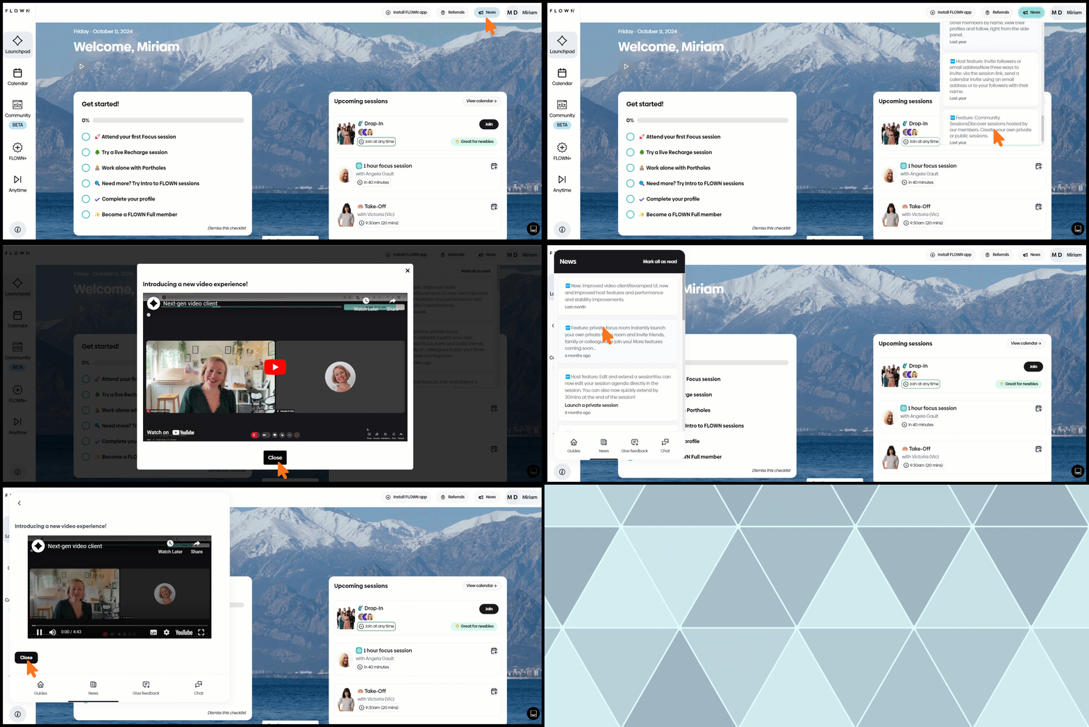
The newsfeed, which includes a list of news and updates, is displayed twice in FLOWN: once in the top bar icon and again in the Life Ring Button (Help Center).
Banners and pop-ups for delivering important news
Banners are used for regular updates. Segmented user groups might announce thematic support sessions or productivity coaching, ensuring the content reaches the most interested users. General updates, such as rescheduled sessions or platform maintenance, are delivered without segmentation to keep all users informed.
For significant updates, FLOWN employs large modal Pop-ups to capture user attention. Product Fruits’ AI-powered templates help FLOWN quickly create visually engaging announcements, improving both the speed and quality of communication. Announcement scheduling allows FLOWN to plan communication in advance, while AI-powered pop-up templates enable faster creation of personalized information delivery.
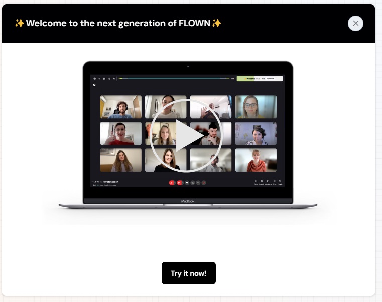
Pop-up

Banner
Results:
- Non-disruptive information delivery, keeping users engaged within the product
- Higher session attendance rates
- More informed, engaged, and satisfied users
“Segmentation and customization of in-app announcements is essential for us. We maintain high engagement without overwhelming others by targeting relevant user groups with tailored news. The customized banners and newsfeed became an integral part of our UI, enhancing the user experience.”— Guy Brockless, Product & Strategy Director at FLOWN
Take The Next Step
Discover more about FLOWN’s user onboarding practices in our case study. Also, learn how to create impactful in-product communication with our webinar recording featuring Adam in just a few steps.
