You’ve put a ton of work into your SaaS product, hitting that launch button with a mix of nerves and excitement. As users trickle in, it hits you– getting them to sign up was just the first step.
The real challenge? Make sure they stick around, really understand what your product is about, and want to keep using it.
This is where onboarding and adoption tools come in.
The right approach to product adoption will help you bust through adoption barriers, reduce churn risk, and continuously deliver “aha” moments that reinforce purchase decisions.
In this article, we’ll explore creative ways to use various onboarding features to maximize product adoption.
Summary of the article:
When you add new functionality, users might miss it among everything else in your product. Hints and tooltips subtly highlight these valuable features right to catch users’ attention, or to share support content when users need it.
Showing new features through eye-catching hints improves the chances of users finding and using them. This makes your product more valuable as users integrate these features into their routines.
The more useful features they adopt, the harder it becomes for them to switch away.
Tooltips also serve as lightweight user education. Instead of overwhelming guides or never-ending tours, they give users bite-sized instructions directly when needed. With clear and readily available support, hints lower the learning curve for new functionality.
Fruity tip: You can use tooltips to drive action, not just instruction. For example, after a user maxes out their free plan’s storage space, you could fire off a hint encouraging an upgrade. It’s a gentle nudge towards paid value.
Look at how Otter.ai uses tooltips to its advantage. When users go to the weekly sync option, it showcases a tooltip that helps them learn about the Otterpilot option.

(Image source: Otter.ai)
Product Fruits makes it simple to create helpful hints and tooltips. A visual editor lets you customize tooltip designs and position them for maximum relevance. Advanced targeting options allow you to show them based on specific user behaviors, attributes, or areas of the product they access.
It gives you the tools to continuously expose users to added value through in-app messaging, driving adoption of your latest features and ensuring none go unused.
Take a peek at creating self-onboarding experiences with hints & tooltips 👀
Interactive tours and walkthroughs let users truly understand and experience the full value your product delivers from the beginning.
Products can be complex, but interactive tours simplify this complexity by breaking down features into digestible pieces. By guiding users step by step, these product tours make learning about the product less overwhelming.
As users become more familiar with your product through guided tours, their confidence grows. This confidence is crucial for adoption; confident users are more likely to explore further, use more features, and integrate the product into their daily routines.
Our clients at Product Fruits report a 70% decrease in support queries. This shows how much easier life gets for everyone when users navigate a product smoothly.
For instance, Writer, a generative AI platform, guides the user at the initial stage with interactive tours to get them acquainted with the usage of the product.
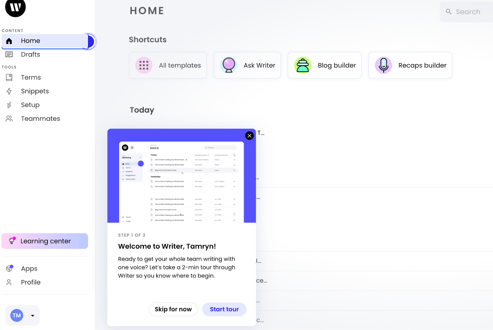
(Image source: Writer)
Product Fruits enables the creation of step-by-step product tours for new features and guides users to learn about the app effectively. Our intuitive editor allows you to create interactive tours, walkthroughs, and guides directly in your app’s UI without involving your IT department.
You can customize the tours to fit your brand’s style perfectly. Our tool also supports custom CSS, so you can add even more advanced styling to make it yours.
👀 Take a peek at a guide to choosing the right product tour software
Even after interactive walkthroughs, users will inevitably have additional questions and need support as they continue to explore your product.
The help center widget puts a wealth of knowledge at users’ fingertips upon request – from searchable FAQs and tutorial videos to chat support and feedback channels. It also provides a platform for communication by adding the chat widget or a “book an individual demo” link.
Easy access to helpful resources directly inside your product interface helps users quickly resolve their doubts. This reduces support tickets during onboarding.
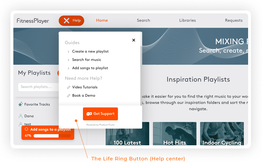
Take Fitness Players, for example. They used Product Fruits to set up a help center in their app. With our tool, they could customize the onboarding elements’ appearance and location in the app, keeping everything aligned with their brand’s style and identity.
With Product Fruits, they reduced churn by 70% from free trial users.
👀 Take a peek at how to integrate live chat into your help center.
(Image source: product fruits)
The Life Ring Button is your trusty support sidekick. It’s a help center accessible from every application page and provides a single access point for support. This means users can easily solve problems without worrying about waiting for support agents.
The Life Ring button can be integrated directly into your knowledge base to source relevant articles related to keywords or common queries from a page URL. As well as connect to 3rd party chat integration. All the support is in one place.
Plus, with Product Fruits, setting up this user-friendly Life Ring Button doesn’t require coding expertise—making support more accessible for everyone.
After the initial onboarding phase, you want to keep users engaged and make them aware of the new value you continue delivering.
Well-timed in-app announcements give companies a powerful tool for communicating their message to users. By announcing new time-saving workflow optimizations, robust reporting insights, or just updated features, you remind users why they chose your solution in the first place.
These announcements educate users on innovative ways to upgrade their experience and derive more value from features they may have overlooked previously. It fuels those “aha!” moments of realizing added potential they haven’t yet tapped into.
👀 Take a peek at unlocking the potential of In-App Announcements with the right strategies
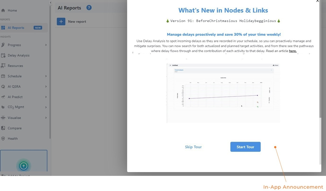
Look at how Nodes & Links, an AI-powered schedule management software, uses Product Fruits to build modal in-app banners that cover the entire screen to capture user attention. These banners show announcements to users who’ve logged in at least twice. That way, they don’t get mixed up with the first-time users’ welcome tour.
These announcements allow users to start a feature tour explaining the change. And for every new user, a tour card shows up once, introducing them to each new section.
You can read exactly how they reduced support tickets by 25%, a case study here
(image source: Product Fruits)
Product Fruits simplifies in-app announcements and allows businesses to create and customize them easily. Users can target specific audiences, schedule announcements, and track performance easily.
With Product Fruits, companies can effectively communicate updates and improvements to users while driving engagement within their product ecosystem.
NPS surveys provide a direct line of feedback to understand what’s working well, what needs improvement, and where users are getting stuck or failing to experience full value.
NPS (Net Promoter Score) surveys allow you to easily gauge user loyalty and satisfaction at different stages of their journey. It identifies adoption roadblocks and friction points.
You can then prioritize driving the adoption of those valuable but overlooked features through targeted messaging, walkthroughs, etc.
👀 Take a peek at 7 Helpful NPS Survey Best Practices to Capture Responses
For example, Mural, a visual work platform, presents a survey immediately after users use its product. Its survey design is engaging and simple, which makes it easy for users to complete.

(image source: mural)
Product Fruits provides pre-built templates to launch NPS surveys quickly. You can also customize survey colors and styles using custom CSS that makes surveys look better and match your brand.
Plus, it offers powerful branching options. You can create different survey paths based on how users answer questions. It tailors surveys to each user and ensures they get the most relevant questions.
Onboarding checklists provide a clear and ordered, step-by-step path for new users to experience your product’s core value propositions and successfully adopt foundational use cases.
By laying out key educational items or “complete by” actions in a checklist format, you give users a tangible sense of progress and accomplishment as they work through onboarding.
Checking off each task delights users with mini “wins” that motivate them to continue exploring further. This accelerates time-to-value and cultivates product mastery from the beginning.
For instance, Evernote, the note-taking app, facilitates user onboarding by centering the checklist upon entering the app.
With this strategic placement, users have immediate access to all the essential information they need and options for upgrading, help, and learning.
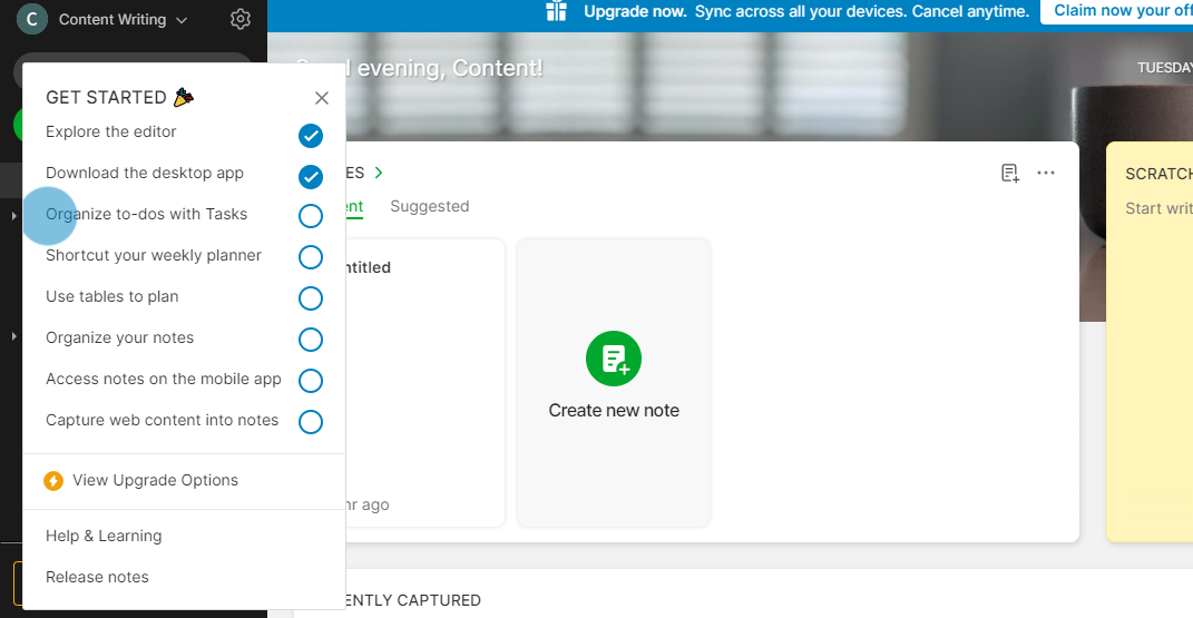
(Image Source: Evernote)
With Product Fruits, you can simplify complicated software onboarding with step-by-step guides. Our intuitive no-code builder lets you create and preview checklists directly in your app’s UI.
You can decide if the checklist appears on your page or as its button. Plus, our integrations help you see which users finish all the onboarding steps and which ones might need help.
The knowledge base is a centralized repository for resources, such as; documentation, tutorial videos, FAQs, and best practice guides.
It’s a great tool to support users throughout the onboarding and feature adoption journey. Almost 89% of users say they’d spend more money if self-serve tools were available.
Both users and companies can benefit from the knowledge base by saving time and improving user experience.
When users can self-serve answers to their questions, it accelerates their progress toward mastery and self-sufficiency with your product.
But, you should update your knowledge base alongside product updates and new feature releases. Continuously improving and refreshing these resources maintains relevance as users’ needs change over time.
👀 Take a peek at the Guide to creating your Knowledge Base
Look at how Slack, a communication and collaboration platform, uses the knowledge base to streamline their work processes. It stands out for its simple navigation and excellent search functionality.
Fruity tip: Look for the content/questions people need the most from different support requests and put those solutions at the beginning of your knowledge base. When customers see answers to their questions right away, they’ll keep returning to it.
With Product Fruits, you can use analytics to see which term rendered the most searches. This will help you prioritize educational resource creation, and to improve respective feature adoption flows.
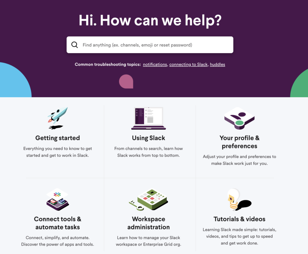
(image source: Slack)
Product Fruits provides a full-featured knowledge base solution that makes creating, organizing, and delivering helpful resources to drive product adoption easy. It stands out by providing secure and reliable knowledge bases. You can control who can access the knowledge base by requiring users to log in. Alternatively, you can integrate the knowledge base into your platform’s domain.
You can easily address users’ questions and concerns. You can upload, update, and edit knowledge articles with just a few clicks and validate that information is always up-to-date and readily available.
At the end of the day, increasing product adoption is all about delivering an exceptional user experience from day one and continuously over time.
Product Fruits provides a powerful suite of tools to make that happen.
From interactive walkthroughs that onboard users with a white-glove approach, to timely in-app messaging that delivers new value to embedded self-service resources – Product Fruits allows you to guide users easily.
We know adopting a new tool is hard enough. But with us, you can roll out the red carpet, hold users’ hands, and ultimately win their loyalty by constantly delighting them with an experience that works.
Boost adoption once and for all – try Product Fruits and make your product their product.