Onboarding elements are like the instructions, tools, and pieces to build and enjoy your new Ikea couch.
Without those instructions, the chances of misplacing pieces, or setting up the structure incorrectly are high.
Instead, you rely on well-crafted and documented instructions to guide you through the process. Each element contributes to a smooth and successful furniture piece.
By understanding which elements make up a strong and impactful onboarding process, you can prioritize onboarding practices that incorporate each in the process.
Here are a couple of things to consider when choosing onboarding elements
First things first, to help you choose which elements to include in the user onboarding flow, you need to take into a couple of factors.
Understanding the user’s journey
When the user’s goals and objectives are put at the forefront of all user flows, that’s when onboarding features and practices become relevant and effective.
It’s important to identify pain points and create a user journey that solves their problems as quickly as possible.
It’s good practice to gather feedback from customers to gain valuable insight into what features matter most. Another option is to analyze usage patterns, trends, and behaviors with user data to understand customer behavior.
👀 Pssst… Take a peek at our Step-by-Step Guide to Creating User Flows
Set clear onboarding goals
After understanding a user’s goals, then it’s time to set all onboarding efforts towards guiding users to their objective.
The goal is to have a directed and straightforward user journey. You don’t want to confuse or mislead users about all the components of your platform. Define the most important features and build user journeys from there.
As Daniel Musialek says “Don’t ask your user to do a zillion things at once.
Focus on the one or two most important actions, and optimize the onboarding journey towards them”
Define the user’s goals, and optimize all the steps of the onboarding journey towards that action.
Providing relevant support resources
It’s a common misconception that onboarding removes all the need to rely on other documentation to help users understand a platform.
Whilst yes, the platform should be intuitive and easy to use, it shouldn’t be left to the user to figure it out.
Relevent resources guarantee an onboarding experience without challenges and roadblocks. Help documentation should be easy to find and up-to-date, to answer users’ questions quickly and efficiently.
Including links to tutorials, videos, and FAQs can help users understand the product or service more quickly.
5 Elements to include in your user onboarding journey
Ther are five different elements you should include i your user onbaording. Each will provide a learning ecosystem that helps users navigate with confidence.
1. Product tours– a visual roadmap of your platform
Product tours are helpful features during any onboarding journey to help users understand the basic layout and features of a product at a glance.
The goal of interactive product tours is for users to familiarize themselves with the range of features and actions a platform can offer.
Here’s an example of a product tour by HubSpot.
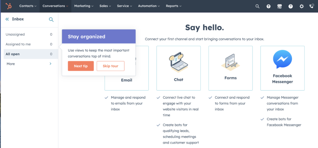
(Image source: HubSpot)
Types of product tours & which you should consider
Product tours can be customized in several forms. The type of product tour depends on the complexity of the platform, amount of steps required, and the level of user knowledge.
Step-by-step product tours: Users follow step-by-step instructions on how to use a product.
Thanks to its self-learning experience, step-by-step tours are the most favored tour, with 81% of users enjoying the experience.
Product video tours: With videos, users get a glimpse of how a product works with a short video.
This allows new users to see the full scope of actions needed to accomplish a task without spending time learning new buttons and actions. It shares their desired outcome quickly.
Thanks to their visual experience, 54% of users agree they appreciate it in their onboarding journey.
Interactive product tours:
As the name suggests, interactive product tours allow users to click through a platform and learn through contextual clues and tips.
The beauty of product tours is that they quickly lead users to the “aha” moment. Where they experience the value of a platform firsthand, which leads to higher engagement and retention in the long term.
2. Hints and tooltips: Provide information on the spot
Hints and tooltips play an important role in the onboarding journey. They serve nuggets of information to users as they explore a platform.
As a result, they highlight the action of features — which gives them a value. This allows users to discover the little features that delight their user experience.
You should include tooltips and hints for icons or features that aren’t easy to understand or notice.
Here’s an example of how MailChimp uses hints to help users navigate the platform.

(Image source: Mailchimp)
They’re also helpful for highlighting new features or action buttons. This allows users to explore new user paths or functionalities of an app.
Fruity Tip: Hints are a great element to accompany interactive product tours. They help provide context for each button as users navigate a new platform.
3. Onboarding checklists: Motivate your users to accomplish onboarding tasks
Onboarding checklists are the perfect combination of guided tours with a hint of gamification.
Thanks to its motivational nature, users who tick off one checklist item are already 21% more likely to complete a full tour.
This is because checklists serve as a list of next actions for users to feel like they are unlocking a new level each time they complete a task.
Here’s an example of how Calendly uses checklists in their onboarding journey. Each step engages users with simple actions until their problem is solved. In this case, creating a scheduling calendar.
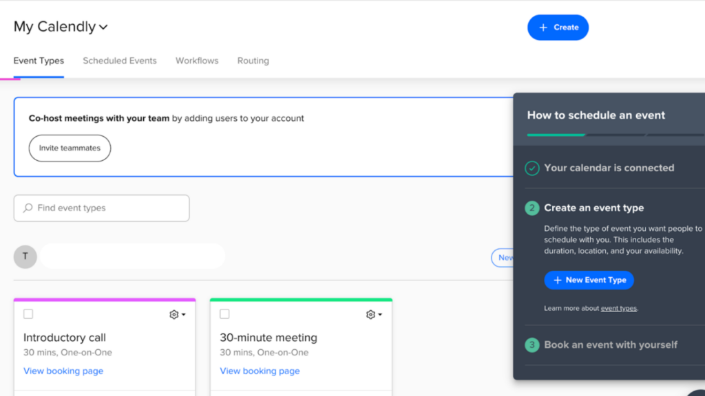
(Image source: Calendly)
Onboarding users with checklists is especially helpful when introducing complex tasks. It can be overwhelming for new users to understand all of the features, but checklists break up the process into smaller and manageable chunks.
4. Surveys: Personalize the experience for each user
Onboarding and welcome surveys provide a unique advantage compared to all other elements of onboarding: direct feedback from users.
Each survey type will be useful for different reasons in the onbaoridng journey.
Add surveys to the user journey to customize the onboarding flow to their specific needs and goals. Each insight users give allows flows to be modified to match their goals.
Welcome surveys usually include a couple of questions to extract the user’s primary focus and goal. The process of tailoring onboarding from users is known as branching.
Survey branching helps, different flows can be activated to guide them to their quickest “aha” moment.
Here’s an example of how Squarespace, a website-building platform, asks its users to share their goals. This allows Squarespace to filter which website themes to show new users, which allows users to find their starting point faster.
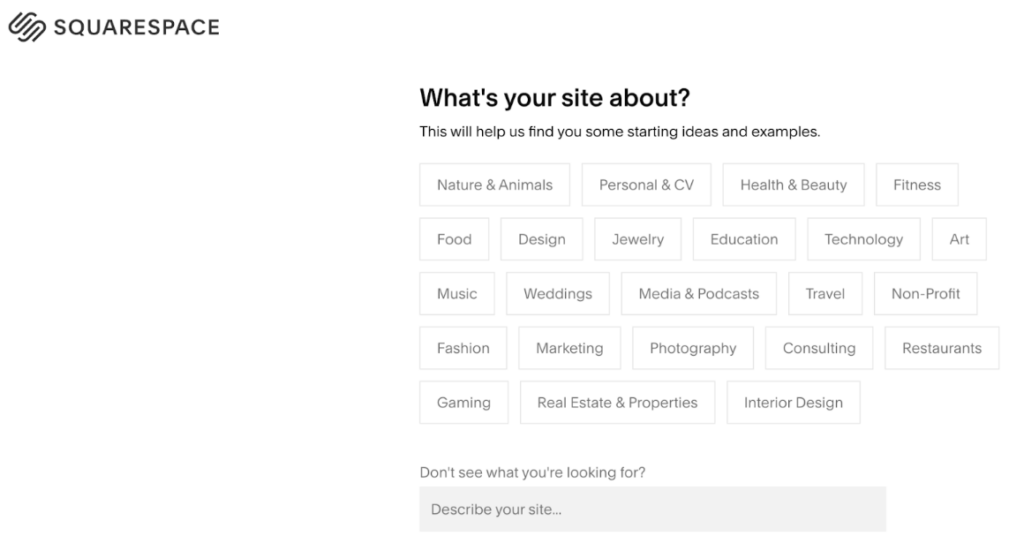
(Image source: Squarespace)
5. Life ring button: Resources and support with a few clicks of a button
Consider Life ring buttons, also known as help centers, as the hidden backbone of onboarding flows.
The goal of Life Rings is to remove any roadblocks new users may face. They provide education tutorials, resources, and documentation to make sure users can accomplish all their tasks.
This means users rely less on customer support to navigate a platform and can self-serve their questions, which over 57% of users prefer.
It’s important to note that life ring buttons rely on an up-to-date and reliable knowledge base. A knowledge base serves as a resource hub for FAQs, documentation, and resources.
Here’s an example of how Slab links users to its knowledge base on its onboarding page.

(Image source: Slab)
Fruity Tip: Include life ring buttons in hints and tooltips. This easy access allows users to quickly learn more about a feature without having to filter through a knowledge base.
Customize all your onboarding elements in one place
It takes a whole toolbox of elements to curate the perfect onboarding experience. From tooltips to surveys, and everything in between, each element plays an important role in the user onboarding journey.
However, creating each onboarding element takes time and a certain skill set. That’s where investing in digital adoption platforms can help. With a platform like Product Fruits, you can add, edit, customize, and optimize each onboarding element to continuously delight your users.
After all, happy users who understand your product equals conversion and profit.
Product Fruits act as an invisible layer you place on top of your platform. It allows you to click and add tooltips, hints, tours, and checklists with a few simple clicks, and no coding is required.
Continuously optimize your onboarding flow, deliver value to your users immediately, and improve your conversion with tools that support your platform’s adoption.
Try Product Fruits for free today — no card required. Or, book a call with our onboarding specialists to discuss the best practices and tools to reach your onboarding goals.
