Pendo is a popular tool for product analytics and user onboarding, but it may not be the best fit for everyone. Many users feel that while Pendo offers powerful features, it can be expensive and overwhelming. Particularly smaller teams or those with more specific needs might want to look for Pendo Alternatives
With so many tools on the market, how do you choose the right one for your SaaS needs?
In this article, we’ve compiled a list of over 11 Pendo competitors and alternatives. We’ll compare their features, pricing, and usability to help you find the best option for your specific goals.
Are you looking for smoother product tours and user engagement?
Try Product Fruits with a free 14-day trial today.
Here are some common complaints about Pendo:

If you’re nodding along to these concerns, don’t worry. Read on to learn about the best Pendo alternatives.

Below, we’ve listed the top 11 Pendo alternatives, complete with their pros, cons, pricing, user reviews, and why you might want to choose each one.
First up is our very own Product Fruits—designed to provide the smoothest user onboarding, engagement, and feedback collection.
Regarding product-led growth and user onboarding, Product Fruits stands out as a more versatile and user-focused solution than Pendo. While Pendo is known for its strong analytics capabilities, it often falls short in delivering the kind of in-depth, interactive onboarding and user engagement features that modern SaaS businesses need. Equally important are ease of use and time-saving features, such as auto-generating onboarding content using AI.
To put it simply, Product Fruits is purpose-built for simplicity. Its laser focus is on creating a seamless user experience while maintaining transparent and accessible pricing. Here’s a deeper dive into why Product Fruits stands out.
Pendo offers robust analytics, but its broad focus on product management and customer insights can feel cumbersome for teams focused only on onboarding. Product Fruits streamlines the onboarding process with intuitive features designed to get users up to speed quickly.
Its no-code editor makes this Pendo alternative easy for teams to build in-app guidance and user flows without extensive technical expertise. The clean user interface also means quicker setup and fewer hurdles during implementation, unlike Pendo, where the learning curve can be steeper due to its complexity.
Product Fruits integrates AI-powered features to simplify the creation of onboarding content. This is a major step up from Pendo’s manually-driven system. With Product Fruits, AI helps to automatically create and optimize user flows, from welcome tours to update notifications. The AI tailors content based on user behavior, which makes it faster and easier to launch personalized experiences at scale.
Pendo does not yet offer this level of automation, which can slow down the rollout of personalized onboarding content.
Messages delivered by the in-app messaging feature reach users right when they’re most engaged—while they’re actively using the product. This direct channel revolutionizes how SaaS companies engage with their customers, offering a level of precision and immediacy that traditional communication channels simply can’t match.
This ensures that key messages, whether it’s onboarding guidance, feature updates, or personalized offers, are delivered when users are most likely to respond, making communication more effective and highly relevant.
In this very short video, hear from our Head of Product, Martin Fišera, about how he uses in-app communication to increase penetration or usage of specific SaaS features.
With Product Fruits, businesses can fully control the look and feel of their in-app guidance. Everything from tooltips to notifications can be tailored to match the brand’s identity. It allows for custom fonts, colors, and even advanced CSS editing and provides more branding options than Pendo.
In contrast, Pendo offers fewer customization options, which can limit the branding of in-app experiences.
Product Fruits stands out from Pendo in another crucial area: customer support. Users consistently praise Product Fruits for its exceptional customer service, citing highly responsive support teams that swiftly resolve issues. Experience this firsthand by booking a demo with our customer success representatives.
A standout feature of Product Fruits is the content map, which provides a comprehensive view of all the onboarding content a user has interacted with. This feature ensures that no steps in the onboarding process are missed and helps product teams identify where users may need additional guidance.
Pendo lacks a similar visual representation, making it harder for teams to track a user’s entire journey across different onboarding steps.
Compared to this alternative, Pendo has faced some criticism for data update delays and performance lags in its analytics, which can slow down teams that need quick, real-time insights. Here is the source.
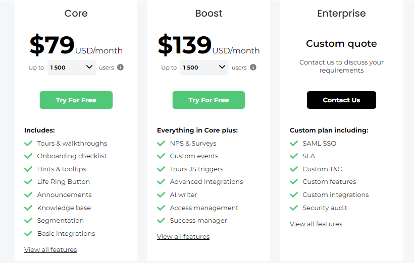
Product Fruits has three pricing levels: the core package is $79 monthly (when billed yearly), followed by the Boost package at $139. This makes Product Fruits an easy way to access all necessary features without overspending. Click here for detailed pricing.
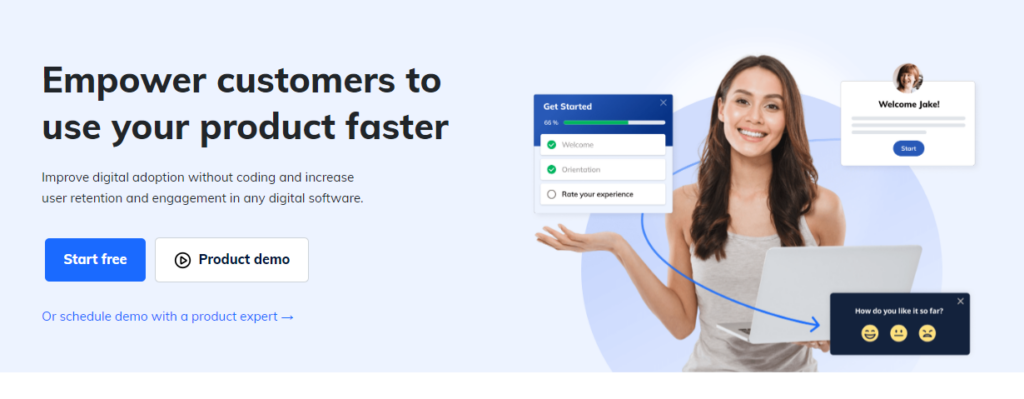
Usetiful is a digital adoption platform built for user onboarding and product adoption in SaaS companies. It’s a good Pendo alternative for small to mid-sized businesses wanting an easier, cheaper solution.
What can it do? Usetiful lets you build interactive product tours, onboarding flows, and in-app guides without coding. Its drag-and-drop setup allows non-tech teams to create guided experiences fast. You can add context-based help that triggers when users take specific actions, giving each person a custom onboarding path.
The tool offers task checklists, in-app survey feedback, and basic user engagement tracking for onboarding content. Usetiful’s strong point is how quick and easy it is to use. While Pendo has more detailed analytics, it can be tricky to set up. Usetiful lets you launch onboarding right away, which works well for companies with small dev teams or those who want a no-fuss tool.
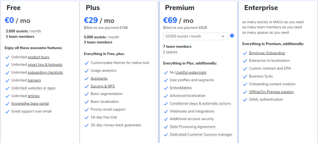
Usetiful’s plans start at $29 monthly, with transparent, flexible pricing. It’s much cheaper than Pendo, making it a good fit for startups and small companies that want solid onboarding without spending too much.
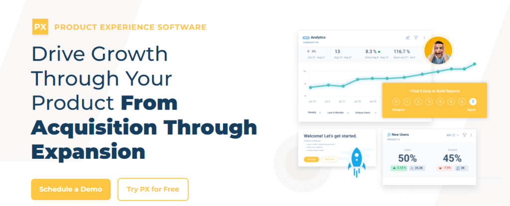
Gainsight PX is a product experience platform designed for large SaaS companies that aim to improve user experiences and boost product adoption. Unlike Pendo’s balanced approach, Gainsight PX excels at combining product analytics with customer feedback and success insights.
What can it do? Gainsight PX offers deep product usage analysis, including cohort studies, funnel tracking, and user journey mapping. It links this data directly to customer health metrics, helping teams spot churn risks and growth chances.
The platform provides in-app guidance tools like tooltips and walkthroughs, allowing personalized onboarding based on user behavior analytics or role. Gainsight PX’s ability to connect product usage to business results is a standout feature. Companies can build custom reports linking engagement to renewal rates and customer lifetime value. The Journey Orchestrator tool automates user communications based on real-time product use and helps reduce friction points.
While exact prices aren’t public, Gainsight PX is typically more expensive than Pendo, reflecting its enterprise-level features. It’s best suited for larger businesses that want to integrate product experience with customer success strategies deeply.

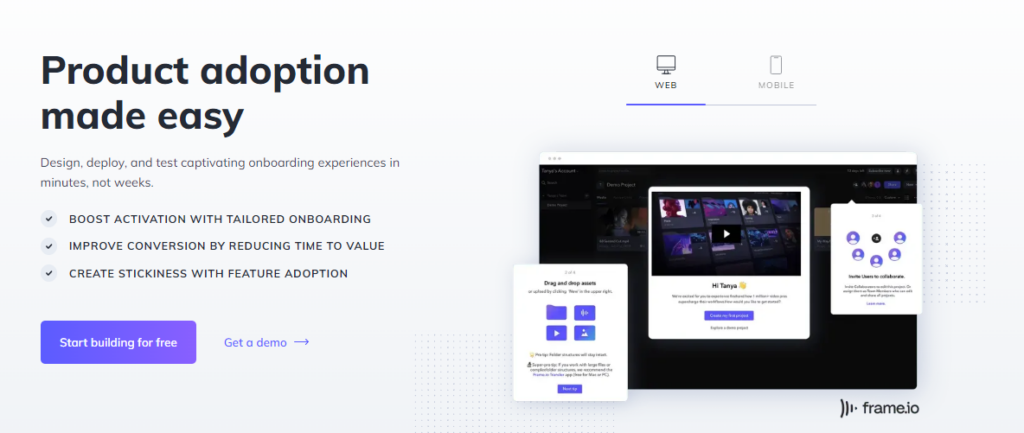
Appcues is a no-code platform for improving user onboarding and engagement in web and mobile apps. With a wide range of UI options and ease of use, it stands out as a Pendo alternative.
What can it do? Appcues lets you build in-app experiences like tooltips, modals, slideouts, and checklists without coding. The drag-and-drop editor simplifies creating and adjusting onboarding flows and reduces the need for tech team support.
The platform works for mobile and web apps, which gives it an edge over Pendo’s more limited mobile functions. It offers basic analytics to track how users interact with in-app content, though it’s not as detailed as Pendo’s analysis tools. Appcues make it easy to create custom experiences for different user groups based on behavior or role. This feature is more user-friendly than Pendo’s, making it quick to adjust content for different users.
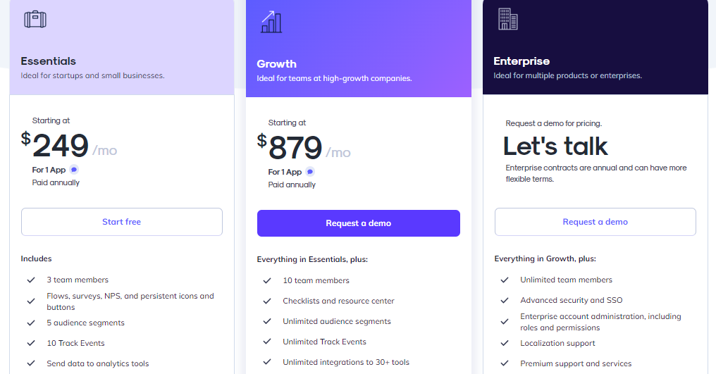
Appcues is cheaper than Pendo, with plans starting at $249 monthly for basic features, $879 monthly for more advanced options, and custom pricing for big companies. However, usage caps on each plan might limit growth for fast-expanding businesses.
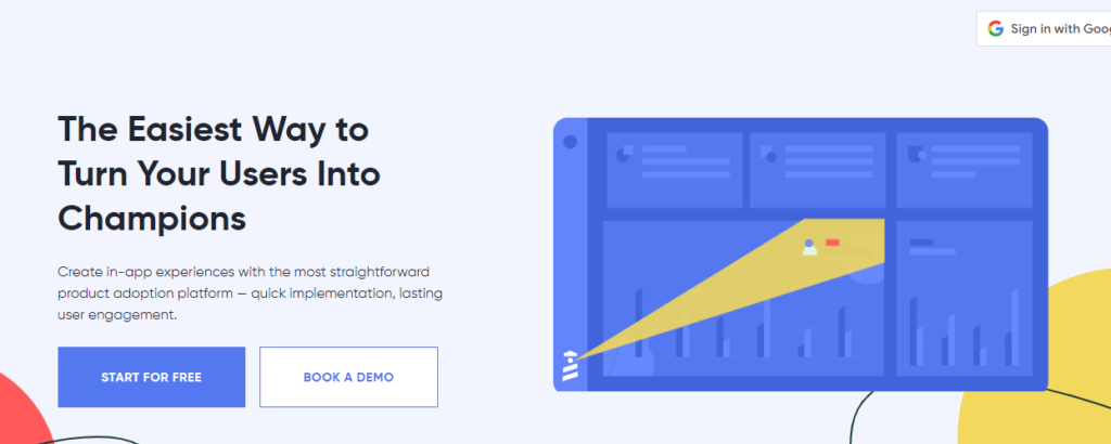
UserGuiding is a no-code platform for SaaS companies and startups to boost user onboarding and product engagement. It’s a Pendo alternative that focuses on simplicity and low cost.
What can it do? UserGuiding offers an easy-to-use interface for creating interactive onboarding flows, product tours, and checklists without coding. It includes UI elements like tooltips, hotspots, and models to guide users through product features.
The platform allows teams to build in-app resource centers, giving users access to FAQs and guides directly in the product. This helps reduce support requests. UserGuiding also has in-app feedback tools for gathering user insights through surveys and forms. For analytics, UserGuiding provides basic tracking of in-app content performance. It shows how many users finish onboarding tours and where they drop off. While not as comprehensive as Pendo’s analytics, it’s enough for many startups to measure onboarding success.
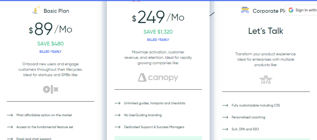
UserGuiding is a notably cheaper Pendo’s competitor. Plans start at $89 monthly for up to 2,500 monthly tracked users (MTUs), $370 monthly for up to 20,000 MTUs, and $689+ monthly for custom features and higher usage. This pricing is based on MTU usage, with extra fees for exceeding limits.
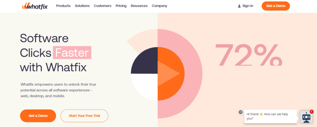
Whatfix is a digital adoption platform that improves employee and customer onboarding through interactive guidance and in-app support.
What can it do? The platform provides contextual guidance with self-help menus and interactive content. Users can access help articles, FAQs, and videos based on their location in the app. Whatfix integrates with learning management systems (LMS), allowing companies to import existing training modules.
Whatfix is compatible with customer-facing and internal applications, including software like Salesforce and Workday. It includes analytics to track user interaction, feature usage, and completion rates for onboarding flows. It supports cohort analysis, user journey mapping, and custom event tracking. A unique feature is Whatfix’s AI-powered automation and personalization. Based on each user’s journey, it can trigger personalized tooltips and onboarding checklists. It also supports AI chatbots for automated responses to user queries.
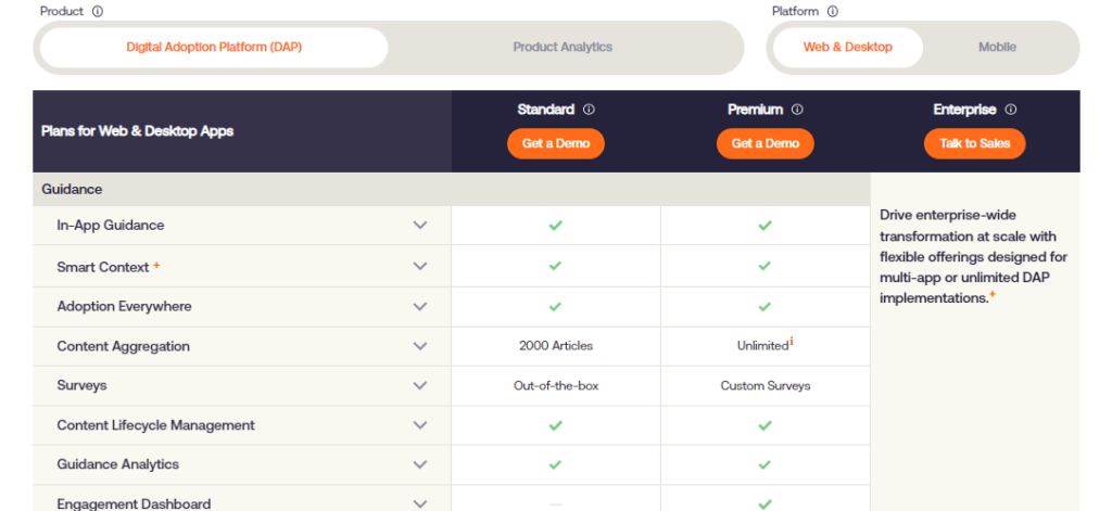
Whatfix doesn’t publish its prices, but it’s considered more affordable for enterprise solutions than competitors. With web, mobile, desktop, and enterprise solutions packages, pricing is customized for each customer’s needs.
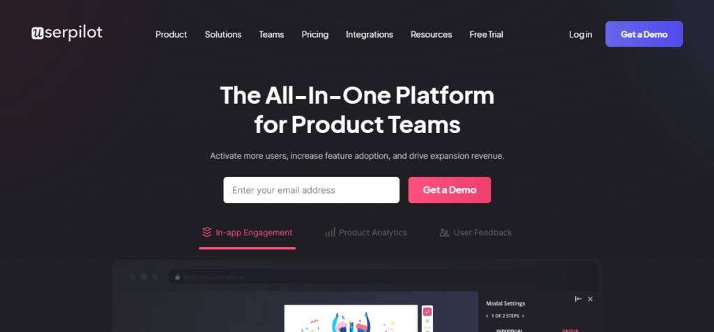
Userpilot is a no-code digital adoption platform built for SaaS product teams to enhance user onboarding, feature adoption, and engagement.
What can it do? The platform offers behavioral segmentation and user targeting. Teams can segment users based on behavior and product usage to deliver tailored experiences. This feature is more intuitive in Userpilot than Pendo, which makes creating behavior-driven flows and specific user journeys easier.
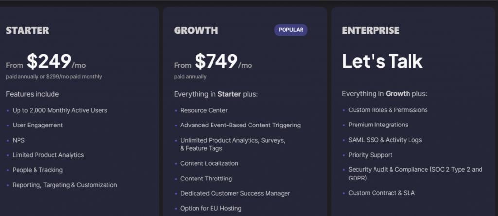
Userpilot includes in-app feedback tools with customizable surveys, including NPS and user feedback forms. Unlike Pendo, which may require additional setup for complex surveys, Userpilot’s feedback collection is more straightforward. It also supports feature tagging and A/B testing to track user responses to product updates.
UserPilot has three different tier prices, starting from $249 monthly. The real benefits, such as resource centers, localization, and a dedicated customer success manager, are only available to those who subscribe to their growth plan, which starts at $749 monthly.
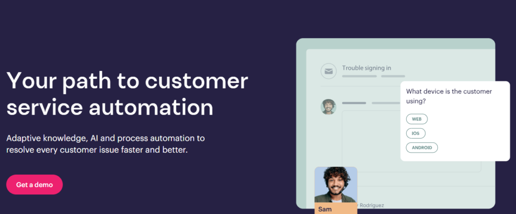
Stonly is a tool for creating interactive knowledge bases and in-app guidance. Unlike Pendo, Stonly focuses on building step-by-step tutorials and dynamic help content that can be embedded in websites, apps, or customer support portals.
What can it do? Stonly offers contextual onboarding and help features, which allow users to receive tailored instructions based on their actions within an app. It also supports non-linear help that lets users access specific guidance without following a rigid path.
The platform allows teams to create visually rich, structured knowledge bases that are easy to maintain and update. Stonly’s interactive nature makes it more engaging than static help articles, which benefits customer support teams aiming to reduce support tickets. It offers more flexibility in crafting dynamic user experiences than Pendo’s rigid structure for product tours and in-app messaging. Stonly is also easier to implement and requires minimal setup or coding knowledge, unlike Pendo, which often needs more developer involvement.
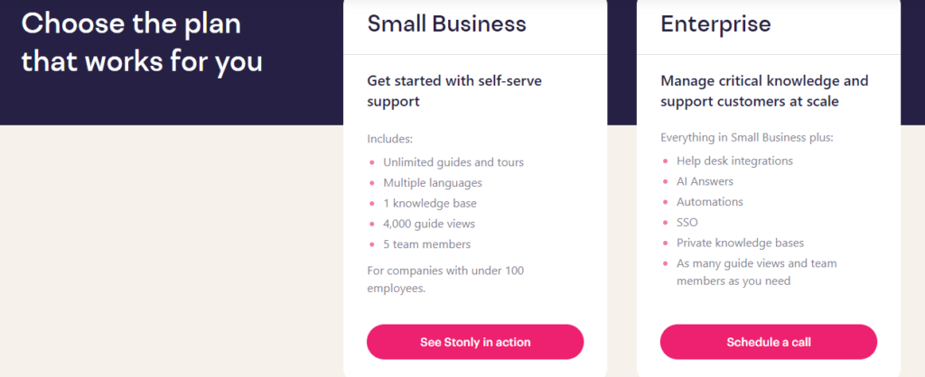
Stonly offers two main plans: the Small Business plan, which costs $249 monthly and includes five team seats, unlimited guides, and multi-language support. But, additional fees apply for over 4,000 guide views per month.
Userlane is a digital adoption platform that offers interactive guidance and in-app training. Its focus on automation and real-time training distinguishes it from Pendo alternatives.
What can it do? Userlane creates interactive, step-by-step guides that act as virtual assistants and show users exactly where to click and what to do next. This approach helps onboard new users or introduce features without overwhelming them.
The platform provides contextual help that appears when users need it. Unlike Pendo’s broader focus on analytics and feedback, Userlane specializes in automating user guidance, which makes it suitable for scaling user training across large teams or customer bases. Userlane works well for both customer onboarding and internal employee training. While it offers some analytics to track guide completion rates and user engagement, its features focus more on training effectiveness than broader product usage insights like Pendo.
Userlane’s pricing is flexible, with custom pricing based on the number of users and required functionality. This model allows companies to scale their platform use as their needs grow without being locked into rigid pricing plans.

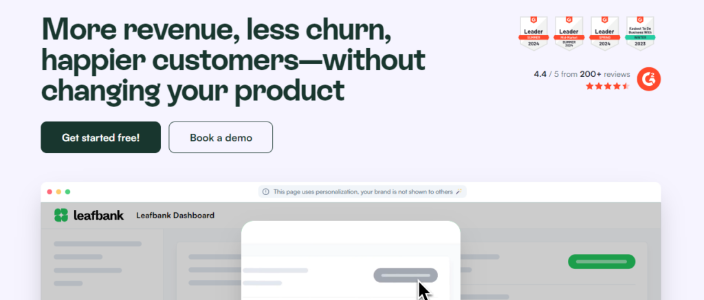
Chameleon is a digital adoption platform known for its high level of customization. It differs from Pendo by offering more granular control over the user experience, especially for teams with technical resources.
What can it do? Chameleon allows extensive customization of in-app guidance and user onboarding, supporting CSS and JavaScript for deep customizations that blend with a brand’s interface.
The platform offers advanced segmentation capabilities that allow teams to build user segments based on behavior, product usage data, and custom attributes. This enables more dynamic, personalized experiences compared to Pendo’s segmentation features. Chameleon’s helpbar feature integrates with existing knowledge bases and FAQs and provides in-app self-service support. The platform also includes Launchers for easy access to in-app support widgets, which can trigger onboarding tours or support resources.
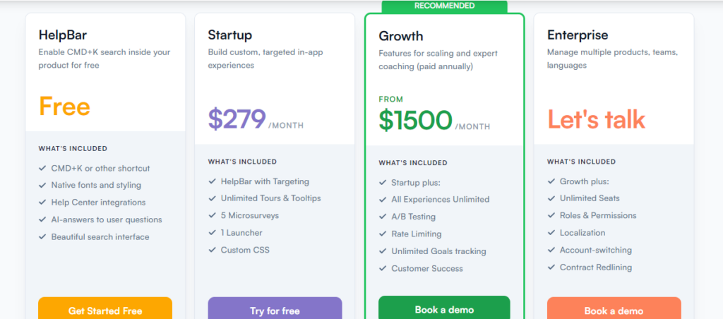
Chameleon’s pricing is more flexible than Pendo’s, with plans starting at $279 monthly for startups and scaling up based on users and features. This structure makes it more budget-friendly for smaller teams needing customizability.
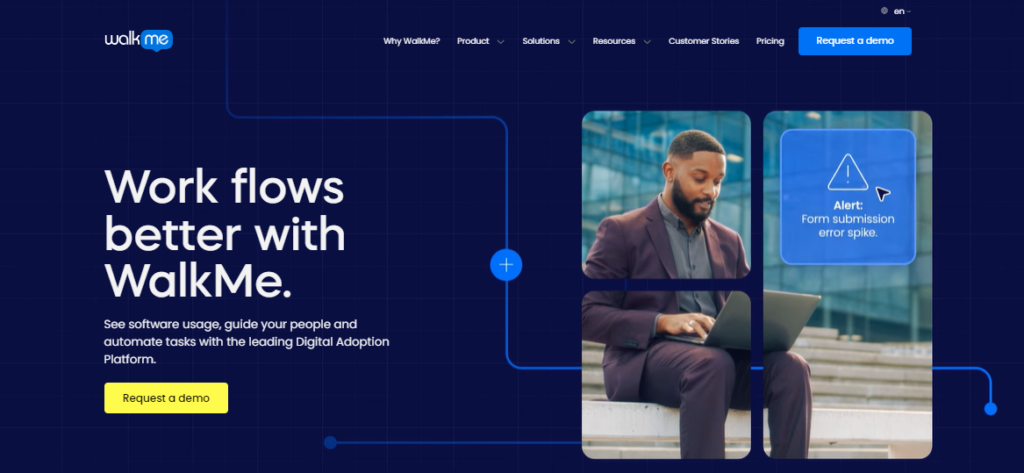
WalkMe is a digital adoption platform designed for large enterprises. It differs from Pendo by offering broader functionality, including employee onboarding and internal software training alongside customer-facing applications.
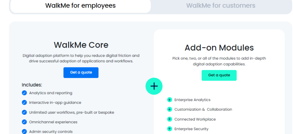
What can it do? WalkMe provides in-app guidance, onboarding, and training for employees and customers. The platform allows the creation of custom workflows, onboarding checklists, interactive walkthroughs, and product tours.
The session playback feature enables teams to watch user sessions and identify issues. The platform integrates with major enterprise systems like Salesforce, Workday, and Microsoft Dynamics and is SCORM and xAPI compliant for learning management systems. WalkMe includes an AI-powered chatbot for contextual help and recommendations. It also allows the automation of routine tasks within software systems. The platform is designed for large-scale deployments across multiple teams, departments, and geographies.
WalkMe offers customized pricing based on specific organizational needs, which makes it suitable for medium-to-large enterprises. While not listed publicly, its pricing tends to be higher due to extensive features, scalability, and support.
When selecting the onboarding and product adoption tool for your company, consider how it can support your growth. The right platform lets you introduce new features without relying on developers and provides a smooth onboarding experience for all users.
To boost engagement, reduce support tickets, and increase conversions, look for a solution that offers updated features, reliable support, and the ability to customize your onboarding process.
Here are a few things to keep in mind when making your decision:
At Product Fruits, we aim to help businesses grow by constantly improving our products, offering best practices, and providing quick, helpful support.
Start your free trial today—no coding or credit card needed. Or, book a call with our team to see how we can help you reach your goals!
