Think of user onboarding flows like building a house – the foundation must be strong and well-constructed to lay the framework for a successful user experience. The onboarding flow is an essential part of the user experience, as it sets the tone for the overall customer journey. Creating a successful user onboarding flow is important to ensure customers stay engaged and continue using your product or service.
In this blog post, we’ll explore creating a perfect user onboarding flow from start to finish.
Haven’t you tried Product Fruits yet? Sign up for our 14-day free trial to design your first user onboarding flow.
A user onboarding flow is a journey that takes users from awareness to understanding, and eventually to action in a platform or product.
The goal of onboarding journeys is to help users understand the value of a platform and complete the signup process to begin using it.
The success of user onboarding flows directly impacts conversion, retention, and customer loyalty, which is why 64% of companies agree defining the user journey is the biggest strategic decision.
User onboarding flows are designed with users in mind, helping them quickly and easily learn about the product or service so they can make an informed decision on whether to use it or not.
Each onboarding flow can offer different approaches depending on the goal of the user and the platform.
Shanelle Mullin defines five approaches:
Each approach will depend on users’ goals, the complexity of the platform, and the fastest route to the “aha” moment.
Designing your onboarding flow is essential to make sure your users get the most out of your product or service.
The following steps will help you get started.
Clear and defined goals will help you adjust the onboarding journey to the most optimal flow to meet users’ needs. Without clear goals, the flow becomes well… aimless.
Understanding the overarching reasons your users choose your platform is the key first step.
You want to immediately show users your platform serves to answer goals.
That means each user onboarding flow needs to be centered around helping users reach their goals as fast as possible.
Before you begin designing your onboarding flow, it’s important to understand what the goal of the process is. Ask yourself these questions:
It’s good practice to talk to ideal personas who would use your app to hear their thoughts firsthand. If you’ve already got a platform with an initial flow, take a look at the data. Where are the most drop-off rates happening? Why are users churning?
These will help you make sure the onboarding flow is closely tied to what users expect. These questions will help ensure that you design a successful user onboarding flow.
Once your goal is defined, create a flow backward from there.
In other words, define the features that help accomplish that goal. For example, if the goal of a user is to track a running workout on their fitness tracking app, then the features needed would be the tracking “start” button, and the choice of fitness activity, in this case running.
Then, string together the set of actions required for the goal in order. In the example from above, this would be “choosing an activity” and pressing the “start”.
With a rough flow of events, you find the optimal route and choose the navigation screens or onboarding tools to guide the user through the flow.
And, the visual flowchart will give you an overview to identify any potential issues before they arise.
👀 Pssst… Take a peek at our 5 Essential Elements to Create a Superior User Onboarding Journey
Once the features are ordered, then it’s time to find the milestones or friction points that live throughout the process.
Milestones are moments that occur when an action happens because of a user’s behavior. They usually help motivate users to proceed to their next tasks and get them closer to accomplishing their goals.
It’s also a good idea to preemptively pinpoint actions or features that require more support for users to understand. Support can come in the form of knowledge bases or help centers. The idea is that resource documentation or support is just a click away.
Once the flow is set, it’s time to add media to the journey. Media helps users grasp ideas quickly visually, through GIFs, screenshots, videos, or photos.
This helps users see the action of certain features and buttons and aids them in perceiving the value of each action immediately.
Additional media like tutorials, video walkthroughs, or interactive demos provide users with information. Which helps them foresee the next steps to complete their journey successfully.
You can also enhance these by using AI video, AI voices, and add text to video tools to create more engaging and accessible content.
Onboarding features include elements like hints, checklists, help centers, and tours. Each feature has a specific role that delivers an optimized onboarding flow for users.
The placement and order for each feature will depend on the complexity of the platform and the length of the flow. For example:
The goal is to place and sequence each onboarding feature in an order that will natively guide users to their desired goal.
Here are a few common mistakes when creating an onboarding flow to avoid:
Here’s an example of a user onboarding workflow by Calendly, an automated meeting schedule platform.
When a user signs up to Calendly, their goal is to save time scheduling meetings (avoid the back and forth of emails) and automatically set up a time on both parties’ calendars.
That means that Calendly needs to show how easy (aka how much time is saved) is by automating the process with a few simple clicks.
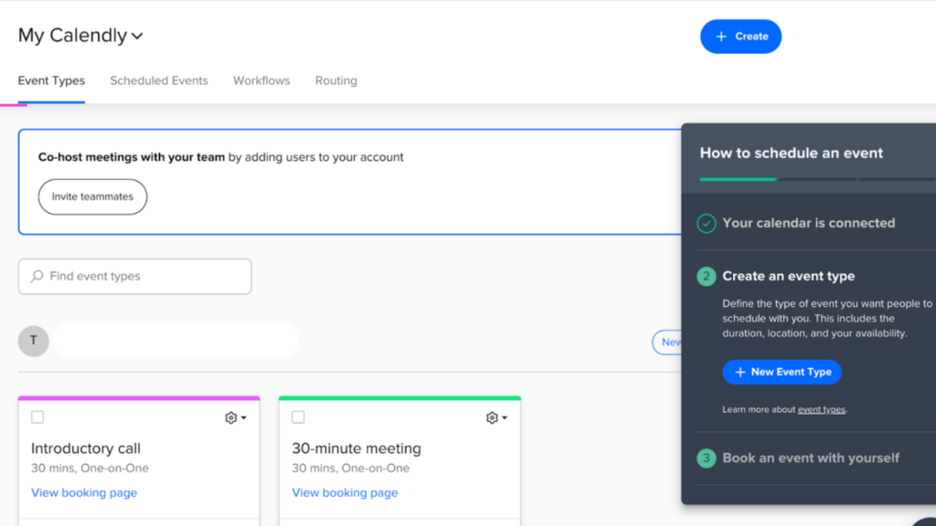
They start with a signup process that is immediately linked to a current calendar (Microsoft or Google).

(Image source: Calendly)
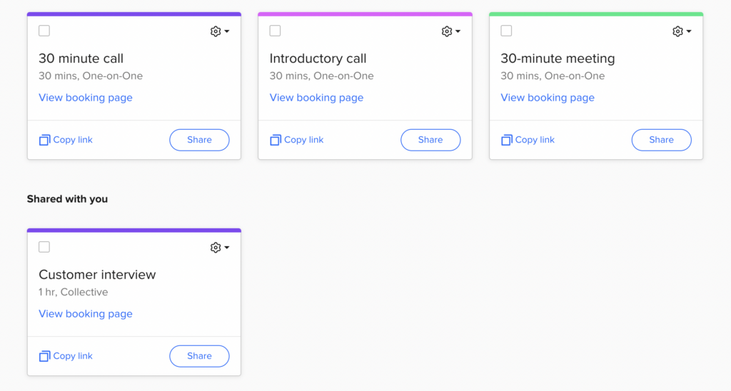
Then, users choose their role in a company. This means users are shown meetings that are most commonly required for their position.

(Image source: Calendly)
Calendly optimizes the process by allowing users to quickly pick their desired meeting times and names from a filtered selection. This delights users and helps them quickly find value in the product.
Then, users quickly finish the whole process with a three-step checklist that motivates and highlights how easy the whole process has been.

(Image source: Calendly)
The idea behind this example is to show how the user flow can be customized for each person’s needs and goals. The main purpose is to use features and screens that bring users to their value as fast as possible without any distractions.
The best user flows are those that offer a mix of onboarding elements that guide the user through a platform naturally.
For that, you need different tools for different functions. That requires development time and skill. That’s where digital adoption platforms can support your onboarding goals with up-to-date features, best practices, and support, and the best part? No coding is required.
Product Fruits is the all-in-one onboarding platform that provides your team with all the tools and features to create a seamless onboarding experience. From surveys to hints, and everything in between, you can edit, modify, customize (or brandify) each element to your company’s needs.
With Product Fruits, you can easily create customized onboarding workflows that fit your product and ensure that users are getting the best out of it.
Book a tailored demo with our user onboarding specialists. We can discuss best practices and tools to help you convert new users with optimized onboarding flows.